
I’m not sure I know the answer. But I do know that colors can make beautiful music together when you play them off one another. This is especially true if you abandon convention — namely, white and cream — and use color to accentuate the architectural details in a home. The hues will make those accents pop and establish a compelling dynamic with the other colors in the room.
As to whether they sing? Well … you be the music critic and decide for yourself.
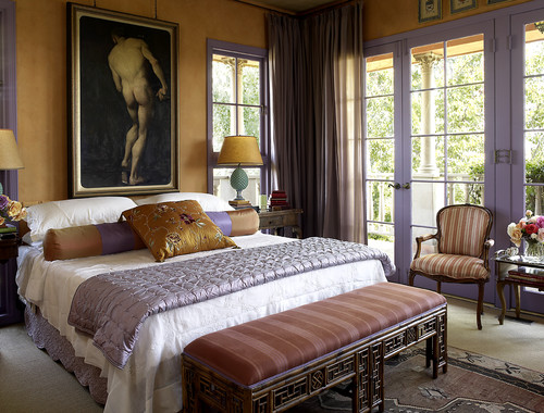
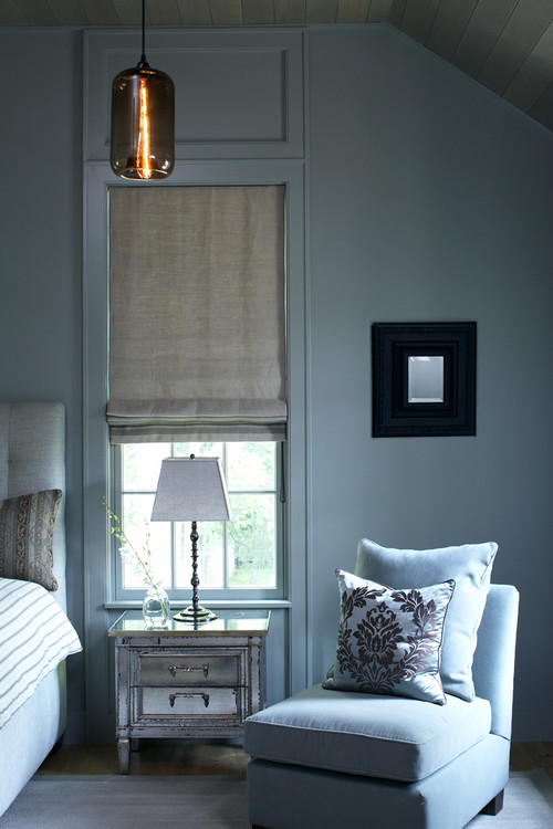
Mediterranean Bedroom by Los Angeles Interior Designers & Decorators Peggy Braswell
Lavender and yellow are an organically inspired color combination. (Just think of the humble pansy.) Now in your mind’s eye, turn the woodwork in this bedroom white. Or, if you’re really brave, cream.
Did you feel the room go flat? That’s the power of color to bring architectural details to life.
Lavender and yellow are an organically inspired color combination. (Just think of the humble pansy.) Now in your mind’s eye, turn the woodwork in this bedroom white. Or, if you’re really brave, cream.
Did you feel the room go flat? That’s the power of color to bring architectural details to life.
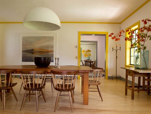
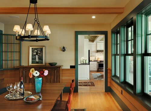
Farmhouse Dining Room by Sharon Architects & Building Designers Rafe Churchill: Traditional Houses
How about the acid-yellow trim in this room, with the otherwise economic decor? The color brings the warmth of sunshine in, doesn’t it? And it makes the spare interior inviting. It’s all the more interesting because the trim in the next room is painted a different color. Picasso would have liked this.
How about the acid-yellow trim in this room, with the otherwise economic decor? The color brings the warmth of sunshine in, doesn’t it? And it makes the spare interior inviting. It’s all the more interesting because the trim in the next room is painted a different color. Picasso would have liked this.
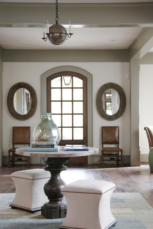
Traditional Entry by Atlanta General Contractors Dresser Homes
Moldings do not have to be painted a vivid color to make a statement. The hues of this two-tone window trim are mimicked in the bold stripe that dresses the wall at the ceiling, and in the painted beam, resulting in rich, layered, classic warmth.
Moldings do not have to be painted a vivid color to make a statement. The hues of this two-tone window trim are mimicked in the bold stripe that dresses the wall at the ceiling, and in the painted beam, resulting in rich, layered, classic warmth.
Traditional Family Room by Mechanicsburg Design-Build Firms Farinelli Construction Inc
When a room is heavy on millwork, a color like this sage green can do a superior job of keeping the space from becoming overwhelmingly woody, and creates a light, lively ambiance.
When a room is heavy on millwork, a color like this sage green can do a superior job of keeping the space from becoming overwhelmingly woody, and creates a light, lively ambiance.
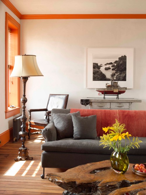
Eclectic Living Room
And then there’s orange, which works best when it’s echoed in other parts of the room.
And then there’s orange, which works best when it’s echoed in other parts of the room.
Rustic Dining Room by Norwich Architects & Building Designers Smith & Vansant Architects PC
And blue-green, which brings out the Craftsman character in this room and keeps the wood from overwhelming the space.
And blue-green, which brings out the Craftsman character in this room and keeps the wood from overwhelming the space.

Eclectic Bedroom
Deep turquoise with lime? Stunning, and a lovely antidote to what could have been an overly reverent all-white space.
By the way, if you are murmuring to yourself about resale and pleasing a prospective buyer, I get that. But unless you are planning to put your house on the market tomorrow, decorate to please yourself, not some stranger.
Contemporary Bedroom by Cambridge Architects & Building Designers LDa Architecture & Interiors
This kind of seamless paint application is soothing and beautiful. Spa-blue trim, rather than white, makes this room calming rather than crisp.
This kind of seamless paint application is soothing and beautiful. Spa-blue trim, rather than white, makes this room calming rather than crisp.
Traditional Porch by Chicago Photographers Cynthia Lynn Photography
The imposing dark color, an old-world black from Benjamin Moore, brings such lovely gravitas to this otherwise informal room, and is a flawless complement to the sage walls.
The imposing dark color, an old-world black from Benjamin Moore, brings such lovely gravitas to this otherwise informal room, and is a flawless complement to the sage walls.
Contemporary Entry by New York Interior Designers & Decorators valerie pasquiou interiors + design, inc
Let’s invite stairs and banisters to join the party. Hopefully you are starting to embrace and revel in the fact that when it comes to painting architectural details, there are no rules, no design police. If you love it, go for it!
Lavender is an impeccable choice for this entry …
Let’s invite stairs and banisters to join the party. Hopefully you are starting to embrace and revel in the fact that when it comes to painting architectural details, there are no rules, no design police. If you love it, go for it!
Lavender is an impeccable choice for this entry …
Traditional Staircase by Norwich Architects & Building Designers Smith & Vansant Architects PC
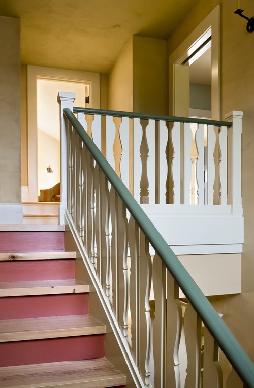
… while the four colors used on this stairway are simply happy. The two shades of the same color on the treads and risers, plus the contrasting but complementary color on the railing, are brilliant.
… while the four colors used on this stairway are simply happy. The two shades of the same color on the treads and risers, plus the contrasting but complementary color on the railing, are brilliant.

Farmhouse Staircase by Brooklyn Photographers Rikki Snyder
If cottage style is your thing, this is for you. Lime-green stairs meet a white banister and a whimsical blue wall treatment. It doesn’t matter how nasty, frigid or hostile it is outside; this stairwell will cheer you up.
If cottage style is your thing, this is for you. Lime-green stairs meet a white banister and a whimsical blue wall treatment. It doesn’t matter how nasty, frigid or hostile it is outside; this stairwell will cheer you up.
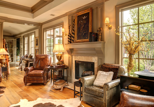
Traditional Family Room by San Francisco Photographers Anthony Lindsey Photography
And then there are fireplace surrounds. Strictly speaking, the mantel refers to the horizontal piece above the firebox, while the part framing the firebox is the surround. (I threw that in for free.)
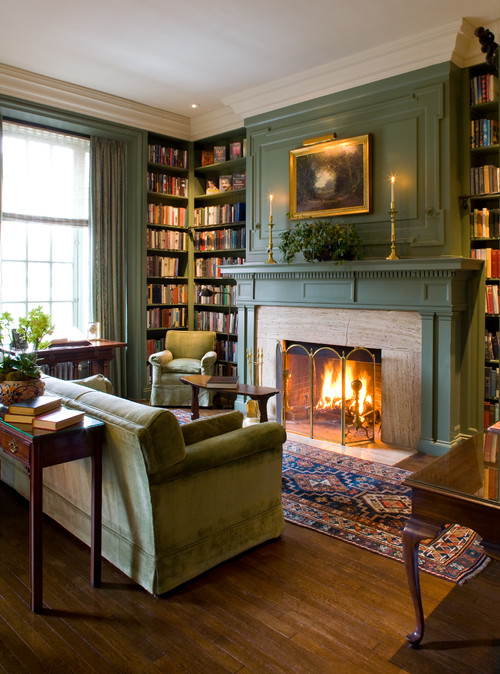
You simply can’t go wrong with a green mantel. Just look outside at green in nature. It’s not just that green goes with everything; it brings every other color to life.
This darker green covers the walls as well as the fireplace surround. The look is a bit more serious than just a green mantel, but it is kept from being too heavy by just the right crisp white on the ceiling.
And then there are fireplace surrounds. Strictly speaking, the mantel refers to the horizontal piece above the firebox, while the part framing the firebox is the surround. (I threw that in for free.)
You simply can’t go wrong with a green mantel. Just look outside at green in nature. It’s not just that green goes with everything; it brings every other color to life.
This darker green covers the walls as well as the fireplace surround. The look is a bit more serious than just a green mantel, but it is kept from being too heavy by just the right crisp white on the ceiling.
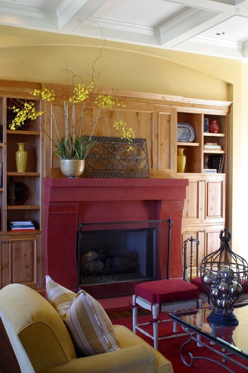
Traditional Family Room by Novato Kitchen & Bath Designers Julie Williams Design
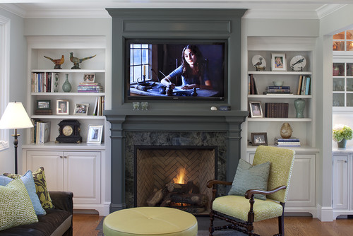
Painting your surround, mantel and chimney breast a color that contrasts with the rest of the woodwork — particularly if the rest of the millwork is white — is a stellar way to bring interest and depth to your room.
Painting your surround, mantel and chimney breast a color that contrasts with the rest of the woodwork — particularly if the rest of the millwork is white — is a stellar way to bring interest and depth to your room.
Rustic Living Room by Honolulu Interior Designers & Decorators Philpotts Interiors
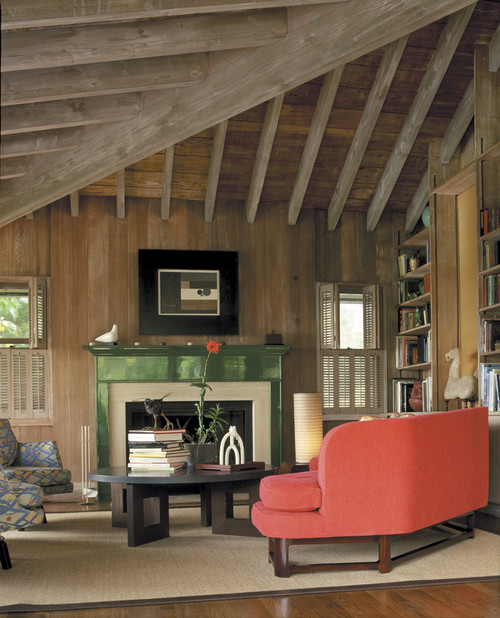
In a room that abounds with wood, like this one, a high-gloss kelly green mantel is unexpected and offers just the right amount of visual relief. Imagine if the mantel were wood instead, or even white. The whole tone of the room would have been ponderous — heavy — rather than fun and fresh.
In a room that abounds with wood, like this one, a high-gloss kelly green mantel is unexpected and offers just the right amount of visual relief. Imagine if the mantel were wood instead, or even white. The whole tone of the room would have been ponderous — heavy — rather than fun and fresh.
Traditional Living Room by Lake Oswego Interior Designers & Decorators Tina Barclay
And then there is red. Ahh … romantic and enticing and comforting.
And then there is red. Ahh … romantic and enticing and comforting.
Traditional Dining Room by Boise Interior Designers & Decorators Judith Balis Interiors
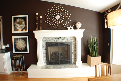
If you have your heart set on a white or cream mantel, consider marrying it to a rich, dark wall color — like Sherwin-Williams’ Black Bean, as shown here. A bold, bright color, such as persimmon or lemon yellow, would work very well, too.
If you have your heart set on a white or cream mantel, consider marrying it to a rich, dark wall color — like Sherwin-Williams’ Black Bean, as shown here. A bold, bright color, such as persimmon or lemon yellow, would work very well, too.
Traditional Bedroom by Alexandria Interior Designers & Decorators The Painted Room
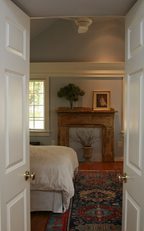
Is it ever a really bad idea to paint a surround? Yes, if you have a stunning stripped-pine antique mantel like this one. Look, love but don’t touch!
If you need inspiration before tackling your millwork, Google “Pablo Picasso” and spend some time bathing in his ingenious, inventive and accomplished use of color.
Disclaimer: This article came from Houzz.
Until
We Meet Again
Claudia
No comments :
Post a Comment